The Golden Ratio is no stranger in the design circles of the auto industry.
Aston Martin gained some great press on its extensive application of the golden ratio in the design of the Rapide S and DB9, with articles appearing in Forbes and the New York Times.
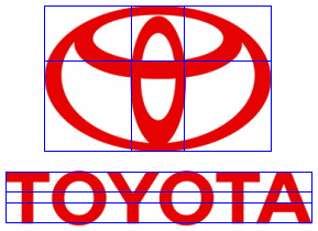
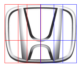
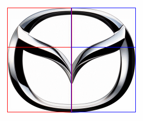
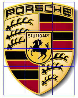
This is hardly the first application of the golden ratio by the auto industry. The logos themselves of a number of the major auto manufacturers show the application of the golden ratio in their design. Consider the following designs, in which the overlay golden ratio grid patterns provided by PhiMatrix software place each line of the grid in golden ratio proportion to the ones on either side of it.
The width of the vertical Toyota oval defined by golden ratio points of the width of the large horizontal oval, and the inside curve of the small horizontal oval is at the golden ratio of the height of the large horizontal oval. This is a great illustration of the basic mathematical relationship that defines the golden ratio, a is to b and b is to c.
Note above that the height of branches of the “Y” and cross bar in the “A” of the Toyota logo are also defined by golden ratio points of the height of the letters.
Note below that many other dimensions of each letter also illustrate golden ratio proportions in their design:
- The vertical line of the “T” in relation to its width
- The width of the “O” in relation to its width
- The vertical line of the “Y” in relation to its width
- The horizontal width of the top of the “A” and the top of the middle horizontal in the “A.”
The Nissan logo is a simple circle with a cross bar, but the width of that cross bar is defined by perfect golden ratio points of the diameter/height of the circle. The design of the letters is also based on golden ratio proportions, as seen in the horizontal lines in the middle of the “S” and “A.”
Honda has another approach. The width of the Honda logo is defined by two golden rectangles, side by side in portrait orientation, shown below with one in red and one in blue. The upper and lower dimensions of the verticals of each side of the “H” are defined by golden ratio points of each of those upright golden rectangles. A golden rectangle, by the way, is one whose sides are in a golden ratio of 1.618 to 1.
The Mazda logo uses the same golden ratio height to width relationship as the Honda logo, with the vertical position of the “M” encircled in the logo also falling roughly at the golden ratio point of the height of the logo.
The Stuttgart emblem in the center of the Porsche logo has a width that is a golden ratio of the midpoint of the width of the shield to the left and right sides. The top of the emblem is at the golden ratio of the midpoint of the height of the shield to the top and bottom.
A special thanks to contributor Shaman Aka for insights and more detailed yet illustrations on golden ratios in the logos of Honda, Mazda, Hyundai, Honda and Mercedes Benz.
Golden ratio grid lines created with PhiMatrix.





+
Cadillac emblem
http://4.bp.blogspot.com/-_pBwlDm8M_Q/UM_Vq1UDrXI/AAAAAAAAAOE/Cm4X_uFw0Kw/s1600/cadillac_logo11.jpg
and Nissan
1. http://farm9.staticflickr.com/8498/8305784340_1665182f82_h.jpg
2. http://25.media.tumblr.com/dc0f927fef08a6b9140d620f17c091a1/tumblr_mflotj7R9A1s0osfzo1_1280.jpg
I believe that the golden number is cool and radtastical;)
I agree with you about the golden number is outstanding in its design. You are right Stone.
I thought this website was helpful to me and grandma lynn to making our world famous apple pies thanks to yall