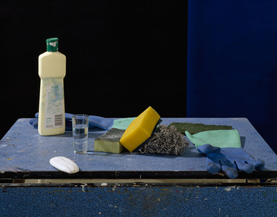
Tim Fisher wrote with his observations on the golden ratio aspects of the winner of the Rose Award and £1000 at the 2012 Royal Academy Summer Exhibition. The photo was submitted by Peter Abrahams as Vanitas: Cleaning, Archival pigment inkjet, 76 x 97 cm.
I agree with Tim’s observations. The original photo was as follows:

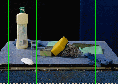
If you overlay a PhiMatrix golden ratio grid to the photo, you reveal the golden ratio dimensions in its composition:

A few key points about the golden ratio overlay:
- It uses the Center mode of PhiMatrix, which draws lines at the horizontal and vertical midpoints, with golden ratio lines radiating out to the edges of the photo.
- This is an example where the golden ratios appear not as applied to the entire photo, but to the elements within it. Note that the original photo has an extra measure of border at the top that is not used in applying the golden ratio proportions of the elements of the composition.
- When properly aligned, the grid shows these golden ratio propotions:
- On horizontal lines – From the back of the table to the baseline of the key objects (glass, sponges, wire brush) to the light colored border at the base of the top of the desk and then to the bottom of the photo.
- On vertical lines – Note the positioning on golden ratio lines of the back to corners of the desk, on the placement of the soap bottle, and on the area bordered by the glass of water and the green cloth. Note also the location of the border between the black and blue sections of the background.

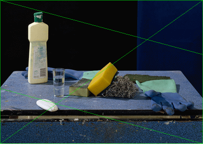
“The background is 2/3rd black and 1/3rd dark blue. f(n) Thus the classic golden ratio. The best known golden ratio being the Fibonacci Sequence perhaps. Follow the mathematical logic and you then you progress to the Fibonacci Rectangles and then the Golden Spiral. The initial golden ratio holds true for this entire image as is the image itself, which is a 2 to 3 ratio too. These colours, black and blue are repeated in the table but in a horizontal format. The table is not level, nor symmetrical, neither on the vertical nor horizontal axis. The table top breaks the confines of the frame at different points on the vertical axis. The table’s H axis break the background in the 2:3 ratio. The table’s V axis is likewise 2:3 when viewed as 1/3rd dark blue and 2/3rds light blue. The items on the table are on a near-perfect diagonal with the soap mimicking / repeating / reinforcing this effect. Thus the table top is now two scalene triangles, both being obtuse. The items, were it a classic still life painting, would be fruit or flowers! This is a painting in the traditional sense in all but name but as you may gather, there’s far more going on that some may at first realise. And that’s just me trying to break it down as a non-mathematician and non-art degree sometimes practitioner. The photographer has used both yellow and cyan and black throughout, three of the four primary colours in photographic printing (the other being magenta); CYMK, where black is the “key” colour. Personally I like it and see precisely why the RA judging panel would love it as it pretty much ticks every box that a professional RA artist has been exposed to over the years. You, of course, may disagree!” The other colour here in the image is green. yellow + blue = green. Meaning green is the subtractive secondary colour of the blue and yellow combined (black, K, is not a feature of additive nor secondary colours). This image would not support magenta in my opinion as it would conflict with the colour wheel in a detrimental way, lessening the overall effect considerably (try mentally making an item on the table red for example and you’ll see what I mean). Clever, eh?
For other illustrations see the YouTube video “Golden Ratio sweeps the awards at an international photo contest.”


Leave a Reply