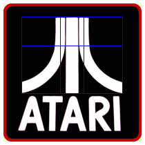
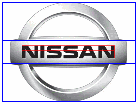
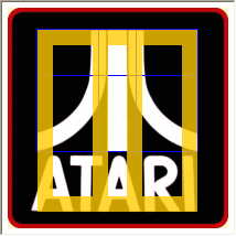
Phi is often applied in product logos.
From Renaissance artists of the 1500’s to graphic artists of today, phi is recognized for its ability to give a sense of aesthetic appeal in balance and harmony of design. Product logos represent an image that must make a positive and memorable impact on the conscious and subconscious minds of consumers, so it is no surprise to find phi proportions in many logo design of major companies. The Phi grid proportions are provided by PhiMatrix software. See other examples of logo design at the PhiMatrix site.
Note: The logos presented on this page are for illustration purposes only of principles of graphic design and are do not imply in any way an endorsement of, or affiliation with, this web site or its affiliate web sites by the companies shown.
 |  |
 | 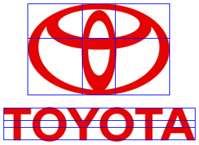 |
Note how every dimensions of each letter of this logo is apparently based on proportions of phi (first golden ratio) or phi squared (second golden ratio):

Phi is also used in the proportions of product design, as illustrated by these soft drink bottles:
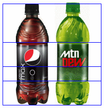
Pepsi’s ad agency did the redesign of the Pepsi logo above by applying concepts of Phi and the construction of the Golden Section. Read it in a 4MB PDF HERE.
In 2015, Google did a redesign of its logo, icons, website layout and more. My article Google Logo and the Golden Ratio in Design shows how the golden ratio was applied to bring harmony throughout all their design elements.
Most companies that apply phi to their logos apply it to the proportions of the logo. What do you do if your logo is simply your company name? Look at the logo below and see if some of the most creative minds in the world of entertainment have found a very creative way to apply phi:
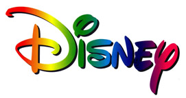
Do you see it? Note from the Phi Symbol page the upper and lower case of phi:
Upper case Phi is Φ and lower case phi is φ.
Also in the category of potential appearances of Phi, look at the signature of President Barack Obama and ponder why the line for the b is through the O instead of to its right:

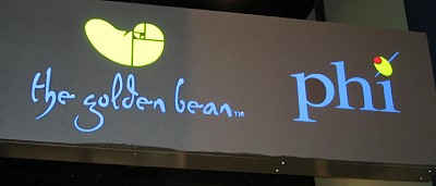
And then there are other creative uses of Phi and the Golden Ratio in marketing, such as a coffee shop called the Golden Bean and a bar called Phi, signatures of Hotel Indigo, which uses a nautilus shell as its logo. Note the golden spiral construction on the bean:



Hi, great info on golden ratio in identity design. Helped me to improve my design knowledge.
Hi my name is Mike. I am trying to design a logo for cigars i am going to start manufacturing. So please contact me to see how you can help me. Thanks.
The Disney name, and logo has the Fibonacci Spiral. Look at the first letter “D.” Do you see the spiral?
I do like the diagrams, but a little more of an explanation would of been better.
Notice how Disney is spelled with neon and the two letters in Disney not used with Phi are N and E. In which together Ne is the symbol for neon in the periodic table. —– Mind Blown.
Good knowledge for logo design,. ..
Sometimes logo need to be as serious as this- using golden ratio. For such a big company it was almost a must to use golden ratio, that is a good thing in many ways.
Thank you for bringing up this matter. It was a great help in creating my next projects which is designing logo for mini market and franchise.
Hi Gary
I thought you might be interested in how the golden ratio can be used to recreate the Apple Park logo. https://www.designbygeometry.com/apple-park-logo-golden-ratio/
Chris
Very nicely done, Chris. Thanks for sharing. Apple’s iOS icon template is indeed based on the golden ratio, which leads to some very aesthetically pleasing icons and logos. The use of golden ratio concentric circles can also be seen in the BP logo and in the windows of the cathedrals of Europe from hundreds of years ago.
some more detail about the Disney logo at the linked site