“Without mathematics there is no art,” said Luca Pacioli, a contemporary of Da Vinci.
Just as the Golden Section is found in the design and beauty of nature, it can also be used to achieve beauty, balance and harmony in art and design. It’s a tool, not a rule, for composition, but learning how to use it can be a great Art 101 lesson on laying out a painting on a canvas.
For those with a deeper understanding yet, the golden ratio can be used in more elegant ways to create aesthetics and visual harmony in any branch of the design arts. As you’ll find in the examples below, it has been used by some of the greatest artists the world has known.
Oddly enough, you may also find critics who say that the golden ratio cannot be found in art at all. Such statements often come from Ph.D.s in mathematics who hold a very theoretical viewpoint that nothing in the real world can be a golden ratio. Why? Simply because it has an infinite number of digits. (See a review/rebuttal on art and architecture and design.) Pi does too, so this way of thinking says there are no circles in the real world either. For the rest of us, practical applications of mathematical concepts are a simple and necessary everyday occurrence in the arts, engineering and applied sciences.
Leonardo da Vinci
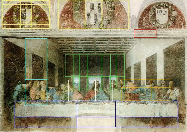
The Golden Section was used extensively by Leonardo Da Vinci. Note how all the key dimensions of the room, the table and ornamental shields in Da Vinci’s “The Last Supper” were based on the Golden Ratio, which was known in the Renaissance period as The Divine Proportion. The lines showing Da Vinci’s intricate use of the Divine proportion were creating using PhiMatrix golden ratio design and analysis software:
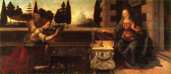
Note in Da Vinci’s “The Annuciation” that the brick wall of the courtyard is in golden ratio proportion to the top and bottom of the painting:
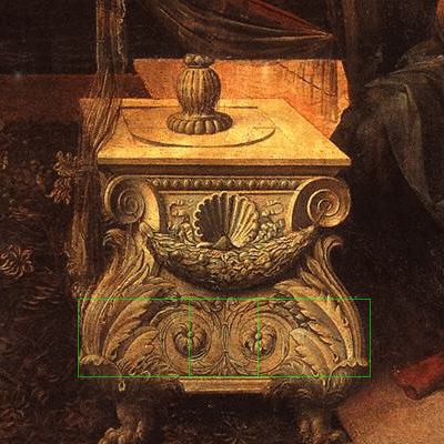
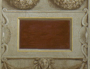
Even the fine details of the emblems on the table appear to have been positioned based on golden proportions of the width of the table:
Other golden proportions can be found in “The Annunciation” that illustrate the point and give evidence of Da Vinci’s intent. See other examples of Da Vinci’s use of the Divine proportion here and my article on the beautiful golden ratios in his painting “Salvator Mundi.” The golden ratios that Leonardo da Vinci used in the composition of this painting are explored in the video below:
Select 720p from the settings (gear) icon to see it in full HD resolution.
Click on HERE to go directly to HD resolution on YouTube.
Michelangelo
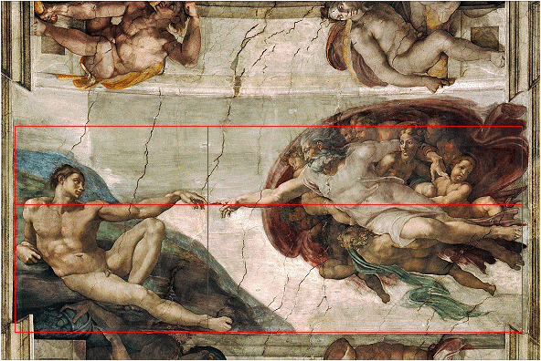
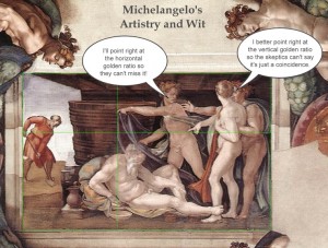
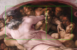
In Michelangelo’s painting of “The Creation of Adam” on the ceiling of the Sistine Chapel, look at the section of the painting bounded by God and Adam. The finger of God touches the finger of Adam precisely at the golden ratio point of the width and height of the area that contains them both. Alternatively, you can use the horizontal borders of the width of the painting and get the same result. See my separate article revealing Michelangelo’s use of over two dozen golden ratios in his composition of the paintings on the Sistine Chapel. Click on the photos below to see a larger version of the sample images.
- Michelangelo’s wit and artistry combined
- Position of God in relation to the forefront angels
Raphael
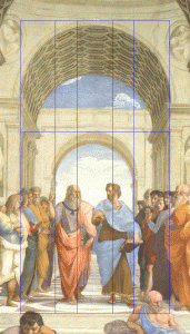
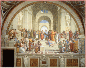
Raphael’s “The School of Athens” provides another wonderful example of the application of the golden ratio in composition. A small golden rectangle at the front and center of the painting signals the artist’s express intent in the use of this proportion. We find that Raphael used golden ratios throughout the painting, giving it a wonderful visual harmony.
Botticelli
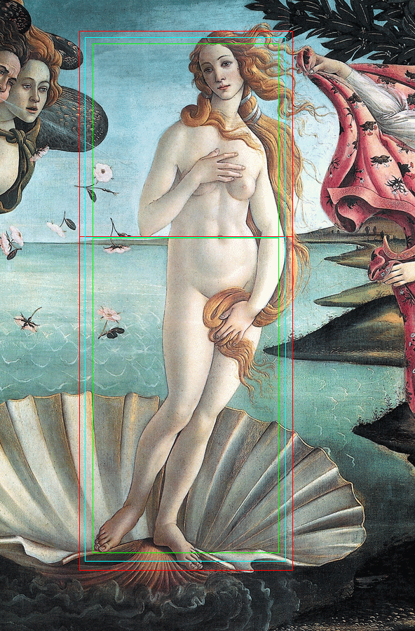
Some say that Bottocelli composed “The Birth of Venus” such that her navel is at the golden ratio of her height, as well as the height of the painting itself. Some argue this isn’t the case. Close examination shows that you can take the golden ratio point using several different logical variations, and they all come to her navel, as well as the bottom tip of her right elbow:
- Red line – From the very top of her hair to the bottom of her lower foot.
- Green line – From her hairline at the top of her forehead to the bottom of her upper foot.
- Blue line – Her height, as measured from the middle of the feet to the top of her head at the back of the part in her hair.
Perhaps a coincidence in composition, but then again perhaps not. See a more extensive analysis yet of golden ratios in The Birth of Venus. The best evidence is that the canvas itself is a golden rectangle, with the ratio of its height to its width in golden ratio proportion. The dimensions of the canvas is 172.5 cm × 278.5 cm (67.9 in × 109.6 in). The width to height ratio is 1.6168, a variance of 0.08%, only 1/20th of an inch, from the Golden Ratio of 1.618.
Seurat
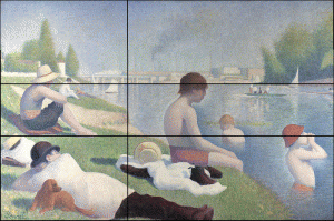
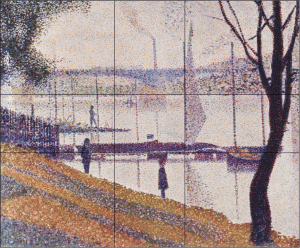
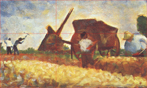
The French impressionist painter Georges Pierre Seurat is said to have “attacked every canvas by the golden section.” In the examples, below the horizons falls exactly at the golden section of the height of the paintings, as are other key compositional elements of the paintings. A more detailed analysis and commentary with dozens of other examples is provided on page Georges Seurat and the Golden Ratio in Art Composition.
- Vertical line marks the bank edge at center
- Seurat painting with golden ratios at horizon, pier and sail
Edward Burne Jones
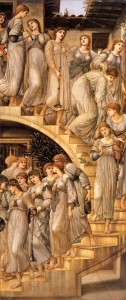
Below, Edward Burne Jones, who created “The Golden Stairs” (Click HERE for enlarged view), also meticulously planned the smallest of details using the golden section. Golden sections appear in the stairs and the ring of the trumpet carried by the fourth woman from the top. The lengths of the gowns from the sash below the breast to the bottom hem hits the phi point at their knees. The width of the interior door at the back of the top of the stairs is a golden section of the width of the top of the opening of the skylight. How many more can you find?
Salvador Dali
In “The Sacrament of the Last Supper,” Salvador Dali framed his painting in a golden rectangle. Following Da Vinci’s lead, Dali positioned the table exactly at the golden section of the height of this painting. He positioned the two disciples at Christ‘s side at the golden sections of the width of the composition. In addition, the windows in the background are formed by a large dodecahedron. Dodecahedrons consist of 12 pentagons, which exhibit phi relationships in their proportions (see the Geometry page for details).
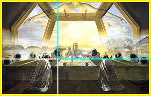
Note: Insights on the use of the Golden Section by Seurat and Dali were provided by Jill Britton.
Art 102 – Painting faces like Da Vinci instead of Picasso … or “Why so long in the face?”
Many art teachers and books will tell you that a face can be drawn by dividing the face in halves and thirds, as follows:
- Draw a horizontal line halfway between the eye line and the bottom of the chin. This is the nose line.
- Draw a horizontal line one-third of the distance below the nose line and the bottom of the oval. This is the mouth line.
That’s a nice approximation, but if you want your faces to have both reality and beauty, use phi. More information on the pervasive appearance of phi in the human face is presented on the Face page, but look at the subtle difference this creates in the length of the nose and overall facial proportions:
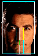
By the books
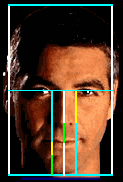
Reality
The mathematical differences in the two approaches are small, but enough to make a noticeable difference:
|
This explains why portraits drawn “by the books” sometimes look a little “long in the face.”

Image source: www.dickblick.com




Hi there;
what about using Phi for a music album price? I actually saw an artist used it. Check out the below link.
http://silentaria.bandcamp.com/album/whats-real
cool
wrong number. she got greedy when it should have been $1.61
this is a cool site
Interesting
I had question about golden ratio, and this site solved it! I like it!
Hi there,
If it’s a universal proportion, does it applies also to concept of chess? Defense or offense when a certain piece is moved in specific square?
Thanks.
hey great question, i had trouble with it but i worked it out. Yes u r right.
Great take on phi, and how it applies to human faces. However, the “by the book” methods are not too inaccurate.
The line halfway between the eye line and the chin line is the line that defines the *very bottom* of the nose (not the tip). While this was recognized in your chart, it was not in your example picture; the one labeled “by the books” puts the tip of the nose at the line instead of the bottom of the nose. When the two pictures are put into photoshop, and a line is drawn on the tip of “by the books”, the line is close to the very bottom of the nose in “reality”. However, I will agree that it is still not completely accurate because this line seems to land in the nose filament (maybe 1/6 (1/4 is too low) of the way down from the tip of the nose).
Also, the line halfway between the bottom of the nose and the chin defines the very bottom of the lower lip, not the actual mouth. This was not mentioned in your chart, as both measurements are listed as the mouth, not the bottom of the lip. The “by the book” picture also assumes that the bottom of the lip line is actually the mouth line.
…although different people that are considered aesthetically pleasing have different lip sizes, so basing something on “the bottom of the lip” may not be the best method to decide where the mouth goes.
Nevermind the mouth comment, I seem to have mysteriously skipped over “one third”.
The “by the book” way I have seen often involved putting a line 3/4 of the way down between the eye line and the chin line, which would indicate the bottom of the lip. With this method, the mouth placement in the “by the book” picture would actually be considered correct, and the face would be stretched downward because of the odd placement of the nose.
I think you may be misinterpretting the context of “by the books.” It is meant to illustrate the deviation from natural facial proportions that occurs when the “rule of thirds” is applied to a face rather than drawing one based on phi, the golden ratio. So yes, the “by the books” illustration has many proportions that do not conform to the natural ones that actually appear on attractive faces.
how do we draw simple shapes like square, rectangle and circle using golden ratio? it is urgent please. i need HELP. WAITING 20 FEB
The golden ratio geometry page shows a variety of constructions of the golden ratio using triangles, squares, rectangles and circles. For practical applications with overlays that work on any program or image take a free trial of PhiMatrix Golden Ratio Software.
Very usefull………keep uploading more
Great site thx a lot!! Really useful and explains a gold section quite well:) do u have one for architecture rather than art?
See https://www.goldennumber.net/architecture/
Phi is popular in music.
TOOL’s album “Lateralus” was constructed in large part using the phi ratio and the fibonacci sequence. Drum beats, syllables per line, lyrical imagery, tempo, track ordering, all wonderfully incorporating this beautiful mathematical marvel.
Also find Vi Hart of YouTube. She’s a self-proclaimed mathemusician and brilliant educator.
I respect that the golden ratio is sometimes used in music, but Lateralus is one obscure song, and Vi Hart is one relatively unknown “mathemusician” so I do not believe these two appearances together comprise “popularity”. Furthermore Lateralus is good, but its not exactly amazing (as seen in the fact that it is little known outside its links to the golden ratio) so this is not proof that ratio is somehow aesthetically pleasing in music
would like to know how to use phi programme for interior designing for a residential layout.
thanks!
Consider looking at Asian (especially Japanese gardens and interiors) as they work with this in approaching it from their special appreciation of innate balance and the comfort of balance as they have experienced it for thousands of years. Perhaps they have a certain mathematical relationship – but the final “adjustments” are from a personal-human level; even superhuman, level. It is certainly “comfortable” and does appear to conform to the “Western” mathematical schemas [including: 1+1 = 2+1 = 3+2 = 5+3 = 8…. Fibonacci Progression!]. As in the layout of formal gardens, the “final” adujstment of a stone’s location is made in consideration of where the viewer is positioned, the size, shape and color of that stone – as well as the time of day and the location of the solar source of light – either sun or moon – as relating to the view AND – perhaps – a PARTICULAR EVENT. So much for “Pure” mathematical analysis!
very helpful article especially about painting faces “by the book”
I loved this website but i was wondering about why and how and what does putting golden rectangles help the artist in any way to make their paintings…o3o
Golden ratios appear in nature, so applying them in design and composition can help to give a painting an instinctive natural appeal or sense of harmony and balance. Golden rectangles though are one specific expression of a golden ratio. There are many other ways to apply golden ratios in design.
Thank you for a very good description and examples of the golden mean.
At last.
Jan
Hypothetically speaking, should we not all, if made by divine proportions, be of the divine? Basically we are all the exact same looking along the lines of a proven proportion in which we are able to show our alikeness but should that not also theoretically mean that we should therefore be the same in other aspects? Hypothetically speaking of course.
-I
In ‘The Sister Secrets’ Roy Doliner claims that Michaelangelo used Kabbalah in his paintings. The four letters of Yahweh Yod – He – Va – He have numerical values 10 + 5 + 6 + 5 = 26. ‘Yod’ means hand and the ratio of Yod to the remainder = 10 : 16 = 5 : 8. This corresponds exactly to the position of God’s hand in your analysis of the painting.
This could be useful way to help find examples of the Golden Ratio the next time you go to an Art Gallery – http://the-golden-ratio.com/the-golden-ratio-camera-app/ . I am looking forward to my next visit to a gallery, even if I am alittle bias.
I’m looking for some information on the use of Fibonacci sequence by Michaelangelo. This article discusses him using Golden ratio, but I was thinking FIbonacci would be most influential in his sculpture of David, but I can’t find it. I’m writing a paper for a math class.
If the statue of David (created in 1501-1504) use the same proportions as Leonardo’s Vitruvian Man (created around 1490), it’s possible that he would have used the body proportions described by Vetruvio. See https://en.wikipedia.org/wiki/Vitruvian_Man and https://www.goldennumber.net/leonardo-da-vinci-golden-ratio-art/. Note too that in many cases the Golden Ratio provides better definition of human proportions than the Fibonacci sequence.
Niiiiiiiiiiiiiiice…, helped a LOT in art 😉
After 50 years of a cerebral career, I retired and am studying art.
This very complicated, yet simple mathematical study is very interesting yet difficult. I can’t seem to wrap my head around it. but will keep at it.
Thank you for sharing
Elizabeth
Here’s a tool that will help you find Fibonacci-based curves and design motifs.
http://interactive-earth.com/resources/general-activities/20-pattern-generator.html
This site has been so helpful. I am doing a project on the Golden Ratio and this site has been my main source throughout. I just wanted to thank you guys for making my project a little bit more interesting and easier. Thank you and have a blessed day!
Most of your (vertical) design examples show a narrow center with two wider panels. I am trying to design a tri-part layout of tile where the center needs to be larger than the two sides. Can I apply the Golden Ratio?
Yes. The most common approach would be to make the center section a golden ratio (61.8%) of the width of the tile. That would put the two sides at 19.1% of the panel, which is half of the “golden ratio of the golden ratio (38.2%). PhiMatrix design software provides a “Center mode” grid, which is useful for identifying and creating other ratios which keep all the panels in golden ratios to one another, as shown below.
An interesting topic. You grasp the mathematics, but not artistic composition. You’ve repeatedly chosen insignificant elements of composition to measure, and overlooked what makes each piece aesthetically valid. For example, the navel of Venus is not very significant compositionally; the curvature of the body, the offset of the head, shoulders,hips, legs, and feet are much more significant. Simply measuring the sizes of subjects, like a scientist rightly would, has little to do with visual composition. The relation and contrast, repetition and pattern of tone, line, hue, etc. are what create visual pathways. A review by someone with strong credentials in art (not me!) would improve the article.
I’d like to offer a slightly different take on this. First I agree with you in that proportion and scale, which is covered here, is just one element of the core principles of design.
Others, depending on your source, can include balance, dominance/emphasis, movement, repetition/pattern, rhythm, variety, unity/harmony, hierarchy and similarity/contrast. In addition to these principles, elements of design include color, line, shape, texture, space and form.
As to identifying only insignificant elements, you need to look not just at this article but at the many examples on the separate articles that are linked from this page. There you will find many more examples of the use of proportion by a number of master artists.
Can the same calculus apply to placing an image, say a square or rectangle, somewhere on a typical home page, regardless of the resolution? Say I want to use the geometric shape as a featured item on the page, does that mean I need to keep the percentage proportion the same as if it were a line? Then, if that is the case, does it matter where the focal point of the geometric shape is found on the page?
I think it does, but creating a formula eludes me.
Thanks…
Yes, the golden ratio is also used in web site design. The principles are the same. The dimensions of your geometric shape should be determined by taking other dimensions and dividing or multiplying them by 1.618. That could apply to the height and width of the shape in relation to the height and width of the web page in pixels.
Thank you so much.
This is my first solo attempt at a web-site design. Any and all help is appreciated.
Very interesting site indeed , as it helped me to calculate the composition painting l am presently working on. I used the Golden ratio five times in my one composition of the Piazza San Marco circa 1480 for the Correr Museum. I based it on Gentile Belinni ‘s procession of the true cross of Christ. I have calculated the entire square with the inclusion of the old Ospizio Orseolo which was demolished three hundred and fifty years ago.. And with the original Campanile which served more as a lighthouse and watchtower. In measuring the height and width of the original Campanile from the compositions ground level.. it exactly measures the same by the millimetre of Leonardo day Vinci’s table on the last supper from the table top to the feet of Christ !! .. That’s spooky, but very exciting to discover. The painting will be hung proudly in the Correr Museum in around two years time.
A math major friend of mine always used to tell me that the whole universe could be understood in numbers. I scoffed at that! This post makes me begin to wonder if there was some iota of truth in what he said.
Consider this quote then from Dr. Stephen Marquart:
“All life is biology.
All biology is physiology.
All physiology is chemistry.
All chemistry is physics.
All physics is math.”
Okay. If you are so excited about the “Golden mean”; aka the Golden Ratio… then give me the FULL Number! Do not tease about your “discovery”! We all deserve you giving us the FULL STORY… The COMPLETE STORY AND the true/complete number! And! They’ll us how to find it and where we may see it Applied. Let us not be left with a fragment of one of The Most Important Numbers known time ManKind! Don’t be selfish: SHARE! Share it in Full!
Okay, I dare you to tell us the first numbers after the decimal point… and show At Least the First (let’s say) 500! Ok?
If you want the true, complete number the golden ratio is calculated as (√5+1)/2. This is an irrational number with an infinite number of random digits, so sharing it “in full” would not only take an infinite amount of time and energy, but would also be a colossal waste of time. In the physical world, real life applications of any mathematical concept or measure rarely require more that 4 to 6 decimal places of accuracy. If you’d like more though see my page at https://www.goldennumber.net/phi-million-places where I list not just the first 500 digits of the golden ratio but rather the first 20,000. If you want to see how it is applied, click on the section headers at the top of any page of this site and explore the articles in the Design/Art, Beauty/Face, Markets/Gaming and other sections. If you’d like to go beyond the hundred plus articles on this site, see the applications listed on my PhiMatrix software site at https://www.phimatrix.com/applications/. There no tease or hold back here. Just dig a little deeper.
Did I miss ‘something’? You seem to state that I had…& U went on then to say the same thing: it is an INFINATE NUMBER! THAT was not my point! I was encouraging others to “investigate” & involve themselves. So; just sit back in your easy chair & awaite tour Super Computer to Print-Out a copy. Just remember man(kind) need only use the Tooles Available and not trumpet your knowledge (wisdom?) of the simple fact that we all accept/know about WHO is in knowledge of that “Number” & most of us spend time with “Him” every week-end.
… ..that’s all.
All hail pi and phi, the twin pillars of existence…